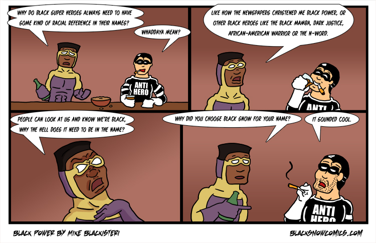
Black Drawing Power?

Well I felt so alone, so insecure, I blamed you instead made sure I was heard, And they tried to warn me of my evil ways, But I couldn’t hear what they had to say. I was wrong, Self destruction’s got me again, I was wrong, I realize now that I was wrong – my shattered confidence
Originally I was set to vent again on that stupid pocast review of I’m Famous! that continues to haunt me. In fact I had every intention of taken things to an uncivil level and going on one of my anger fueled rants. But I won’t. I’ll just say this, I’m still not too happy about it, but it’s done, this is the internet, everyone is entitled to their opinions and has an easy format to spread them. I don’t agree with most of what was said or how I was judged, but that’s what happens you open yourself and your work up to public scrutiny.
All that being said, I had a hell of a time drawing this comic, which should have been simple. For one, I took Jason’s advice and went through the process of finding a new font. I like this one, it’s a classic comic font called Marooned On Mars. Seeing it condensed here for the web I’ll make it a size or two larger next time, and have to paste the individual lines separately so there isn’t such a large gap. I also tried these rounded word bubbles, which were a great challenge for me. But I learned some things that should make it easier next time. And I will admit that this does look a lot better and more professional.
The largest challenge was that my confidence was gone. I questioned almost every line and redrew almost each about 3 times, maybe more. I felt like I was starting from scratch and had to relearn how to draw because my previous efforts were no good. It was awful. Hopefully that won’t last long.
I also tried a new coloring technique, something I did for my guest art work, but is much more time consuming then my normal way. Basically I normally draw everything on one layer in the black outlines, then I duplicate that layer. From there I color the bottom layer in by using the fill feature, but because my tablet causes the lines to be somewhat feathered there is a gap between the filled in color and the black line. So I do a fill of all the black on the top layer, which fills the gap but also makes my lines larger, and sometimes less smooth. So the change I did here was to not do that black fill on the top layer, and instead fill in all those gaps in the bottom layer by hand with my stylus. So it takes a lot longer. Is it worth it because it increases the quality so much? I haven’t decided yet.
So basically my confidence in my talent was quite shaken, as I’ve always been quite insecure about my art. Finishing a comic did help me get some of that back, and hopefully returning the comfort and familiarity of I’m Famous! next will help as well.
Now rock out to some self pity and doubt.